case study
WFSU
WFSU had carefully crafted a new logo, but knew that brand execution is more than just a mark. It's about every aspect of how you communicate, from the typefaces you choose to the tone of your language.
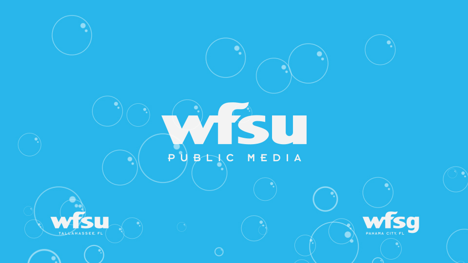
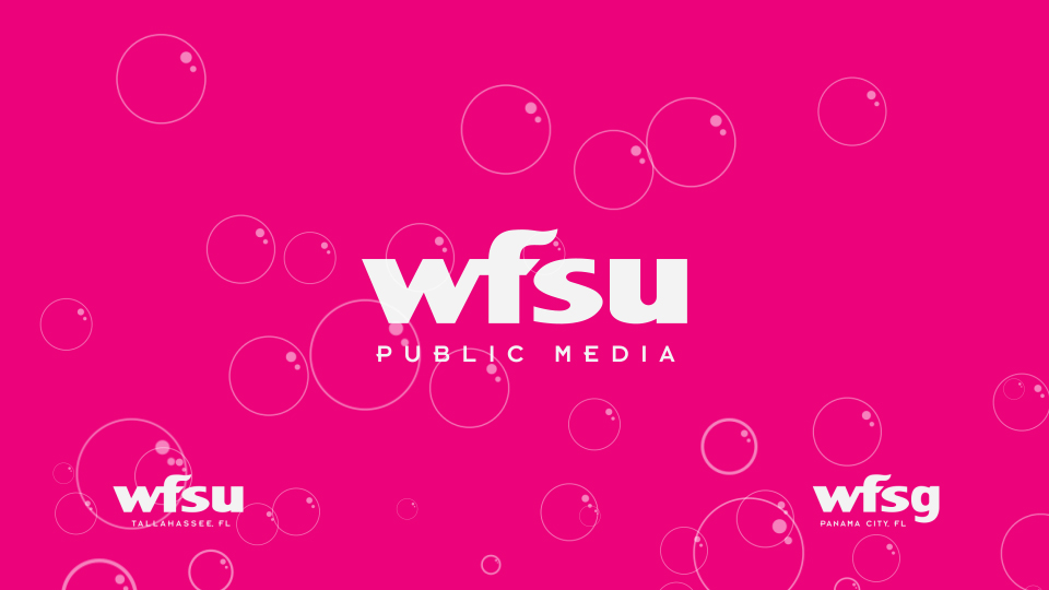
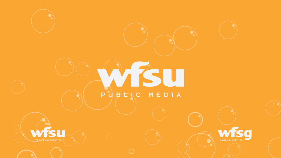
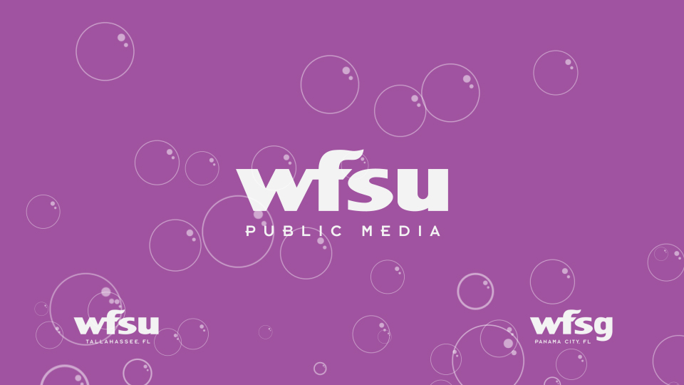
We began by creating a color set that would give the station a large degree of flexibility.
Idents for the TV station came next, with a wave pattern that echoed the flame found in the logo.



Other supporting material included more patterns and ways to treat photographs with color. These were then deployed across all forms of communication, including website, mobile app and email newsletters.



more than meets the eye
When your medium is radio, brand execution is no longer just about what you can see. We created a series of audio brand marks, in a variety instruments and of differing lengths, for use at different times during broadcast. Each instrument has some subtle variation on the basic theme.
adapted for children
With a large part of programming dedicated to children, WFSU needed some variants with a more playful side. A distinct set of colors indicate children's programming, with the bubbles replacing the waves.
